$ sudo apt-get install python python-matplotlib
Then, let's start with a classic plot, sin(x);
$ cat pyPlotTest
#!/usr/bin/python
from pylab import *;
import time;
def log(M):
print "__(log) " + M;
def test00():
D=[];
i=0.0;
while (i < 50.0):
D.append((i,sin(i)));
i+=0.10;
plt.ion();
xlabel('radians');
ylabel('sin(x)');
grid(True);
plt.figure(1);
show();
T=[x[0] for x in D];
L=[x[1] for x in D];
plt.plot(T,L,'b-');
show(block=True);
#---main---
log("main process initializing");
test00();
log("main process terminating");
The result is calculating a data set followed by plotting the data and allowing the user to manipulate the plots (e.g. zooming, panning, ...).
Running the script and you'll be presented with the following interactive graph;
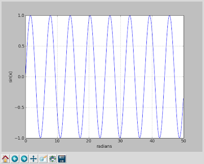
The graph is interactive, allowing panning, zooming and such. It provides similar capabilities as gnuPlot, for those of you familiar with that utility. This short example demonstrates the simplest of examples. The library provides a full feature plotting solution for far more advanced plots, such as:

For more detailed features, refer to the MatlabLib site: http://matplotlib.org/contents.html
Cheers.
Running the script and you'll be presented with the following interactive graph;
The graph is interactive, allowing panning, zooming and such. It provides similar capabilities as gnuPlot, for those of you familiar with that utility. This short example demonstrates the simplest of examples. The library provides a full feature plotting solution for far more advanced plots, such as:

For more detailed features, refer to the MatlabLib site: http://matplotlib.org/contents.html
Cheers.
No comments:
Post a Comment